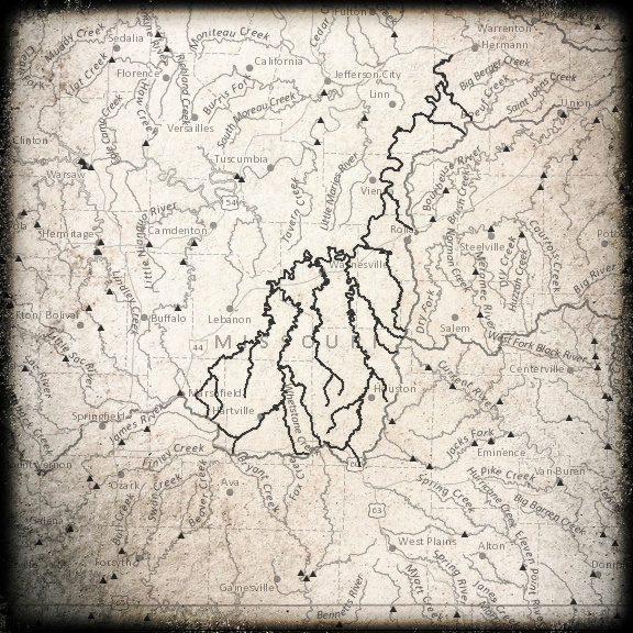
With help from the brand-new National Atlas Streamer Map and Pixlr, I've been having fun with watershed maps all morning. I've been delighted by what I could learn and create. Like this information on the Gasconade River, my home watershed*:
Trace Details
Trace Direction: UpstreamTrace Origin Stream Name: Gasconade River
Trace Origin (latitude, longitude): 38.676, -91.556
Trace Origin Elevation (feet): 614
Water Features
Total Length of Traced Streams (miles): 800Outlet Waterbody: Gulf of Mexico
USGS Stream Gages (count): 12
Stream Names (count): 18
Political Features
U.S. States (count): 1U.S. Counties (count): 12
Total County Population (2010): 320,595
Cities (count): 31
For people without a fancy geography system, this is a phenomenal way to report statistics and details at the watershed level. I have hoped for some easy way to make this kind of calculation for the kinds of articles I want to write. So journalists, take heed! There's more to a border than a line on the map. (Actually, there are many, many lines.)
And that's just the summary report. In detail, you can see the USGS stream gauge locations, the stream names of all the creeks that feed into your selected river, and the counties and cities inside that watershed. Oh, what the heck, here's the rest of the information:
